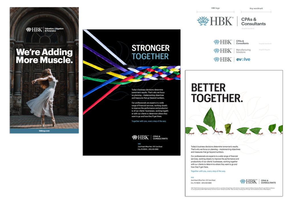
As a new Creative Director at HBK, I updated the brand to make it more competitive visually. This included a typography update to the sub-brand logos, increased use of secondary accent colors, and incorporating the brand’s lotus graphic into primary photography. The lotus represents HBK’s support of our clients and is incorporated into the middle-ground, allowing the focus in photography to be the client.
CATEGORIES: Branding